Creating sweet egg memories
The design is a playful rebranding of DOVO, an egg product local company, planning to reach a wider audience beyond the food and cooking industry.
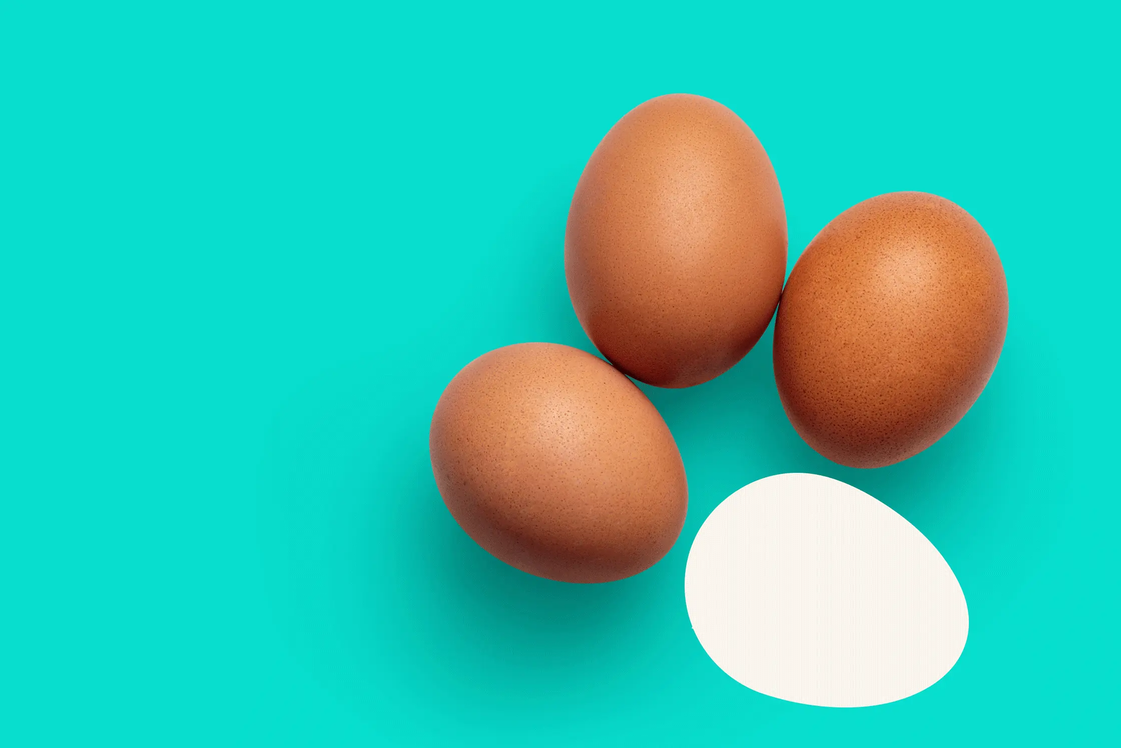
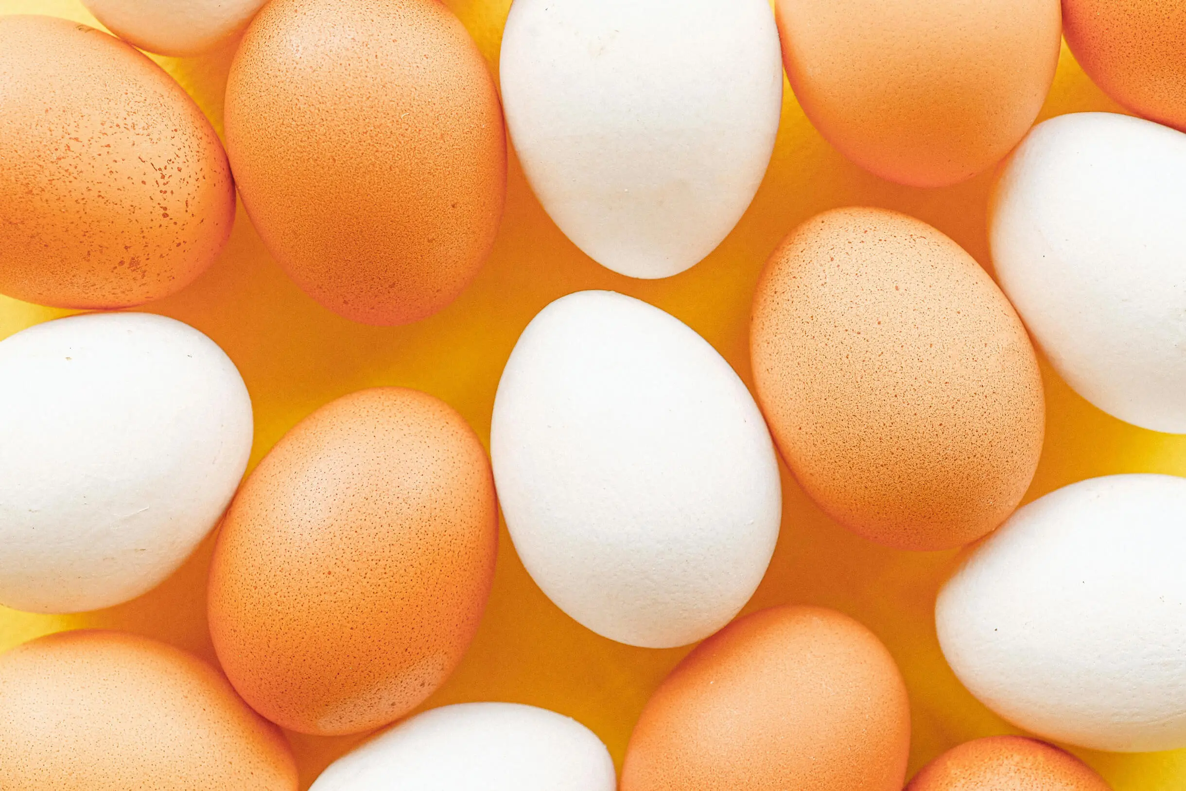
"OVO" means egg in Portuguese. “Dovo” sounds like "from egg". The company sells various products, such as whites, boiled eggs or the sweet orangy paste used in Portuguese desserts.
Date
2023
Client
Design challenge
Credits
Photography: Pexels, Mockup Graphics
What I did
Finding connection among the chaos
Overview
During research it was clear though the well established brand is known to the greater public, frequently clients couldn’t describe its products with precision or only knew the liquid whites product.
The design process centred on creating a specific brand for each product that would bring unity to the product labels and packaging, to ensure greater loyalty of the clients.

Yolks and whites, this and that
THE BRAND
The rebranding appeals to a younger audience, with a more contemporary realm.
Alongside the logo, it uses the "O" modified an egg shape as the main imagery. Besides different vector illustrations are used to make package information less heavy and easily read.


The creative process was spontaneous: the package idea was sprouting at the same time as the logo.
PACKaGING
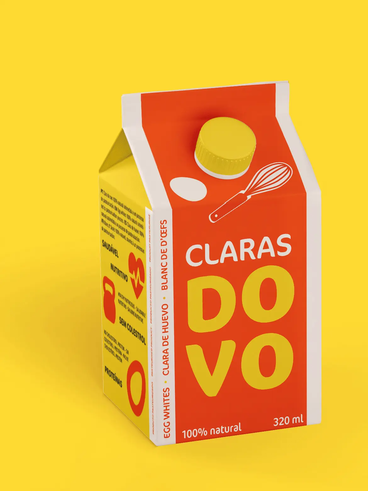


The choice of words gave continuity to the bright energy behind the redesign.
ThE Image

* Natural egg flavooooooour

You don’t need to.
(DOVO sounds like “novo”, meaning new.)
* DOVO, 15 days, old. Do you know how to tell a egg is new?