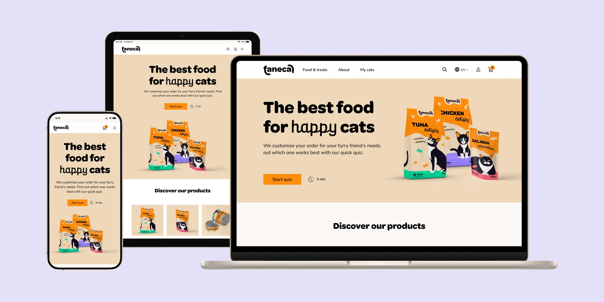
Trustworthy, custom-made and easy
Faneca is a self-made e-commerce website for a cat food brand that offers subscriptions. The brand focuses on quality first, trust and being emotionally resonant to cat lovers.
I asked how a new brand in a highly competitive market could launch in the digital market, drive revenue growth, and deliver a solution centred on customer satisfaction, from research to design.
View prototype
Date
2024
Client
Self-initiated
Credits
Photography: Rawpixel, Graphicpear, Freepik
Other acknowledgments: research participants, peers who reviewed project
What I did
User-centric purchase experience
Overview & Process
Where we started
The challenge was to ensure online commercialisation of a new cat food brand, how the project could launch, ensure profit and brand loyalty.
My role
End-to-end project, including research users needs, business goals to deliver a final prototype.
Encompasses usability testing, iterations and evaluating the project.
The outcome
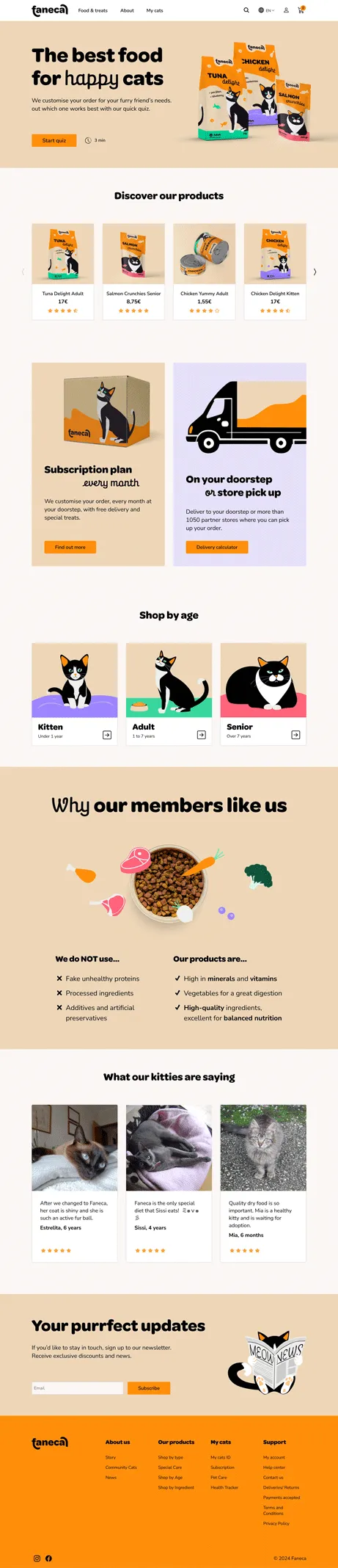
User-friendly responsive website, with custom-made content, with a pleasant and time-efficient shopping experience.
Discovering the needs of users and business
USER and Market RESEARCH
Surveys and informal conversations were done with cat guardians to help understand how they take care of their cats, their needs and pain points when purchasing food online.
It helped map out what users were looking for in cat food brand, discover major competitors, and how Faneca could differentiate itself.
How do you purchase their food?

25% Supermarket & online
25% Online shopping
25% Supermarket & pet food store
12,5% Pet food store
12,5% Vet
What are your cat’s food preferences?

High preferences / allergies
No preferences
75% of cats are picky eaters or have allergies
Factors contributing for customers' choice
Quality
Most users value quality and variety first and show loyalty to the brand chosen.
Convenience
Easy to pick up, easy to buy are a granted plus.
Price
Customers are used to look for bargains/ discounts online.
Time
Users will order online if it saves time.
Delivery
Unpredictable delivery prevents users from buying online.
The customer's problem
Customers are frustrated with cat food pricing and lack of variety in a saturated market. They have to deviate from their routine to find options not available during daily grocery shopping.
Online consumers find the purchasing processes complicated, imposing extra purchases, and the delivery inconsistent.
Online consumers find the purchasing processes complicated, imposing extra purchases, and the delivery inconsistent.
Opportunity for differentiation
By listening to the customer, the brand can tap into a segmented market, distinguishing itself by prioritising quality, dependability, and convenience. By introducing content catered to the cats' needs and a seamless purchase process, it ensures business is meeting the needs of cat guardians.
Meeting business and customer's goals
Business goals
- Reduce risk: address common pain points, avoid difficulties with delivery, lack of transparency, checkout abandonment.
- Position and solidify the brand: increase new customers and repeat purchasers.
- Identifying opportunities: keeping up with the customer's needs and finding new segments to break into.
Customer goals
- Quality: healthy and happy cats .
- Convenience: easy, seamless time-saving purchase experience, consistent delivery.
- Personalisation & flexibility: engaging content, tailored food for cat’s needs, with different possibilities to subscribe.
Straightforward and transparent
usability testing aND Iterations
Unmoderated usability testing was conducted with 5 cat guardians. Users, located worldwide, consisted of cat guardians, aged between 20 and 60.
The main goal was to register any difficulties with the checkout process, and the likability of the homepage. Testing and main interactions were done on the desktop version.
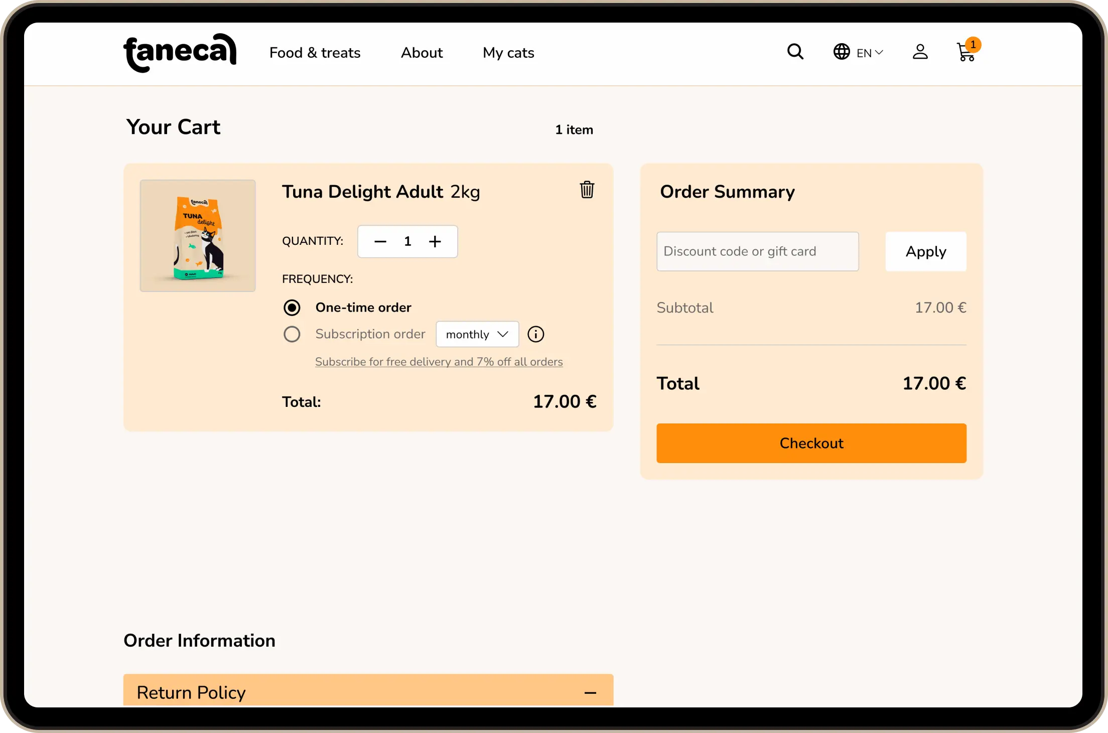
“Important buttons like buy or add to carts aren't visible. I’ll have to scroll first.”
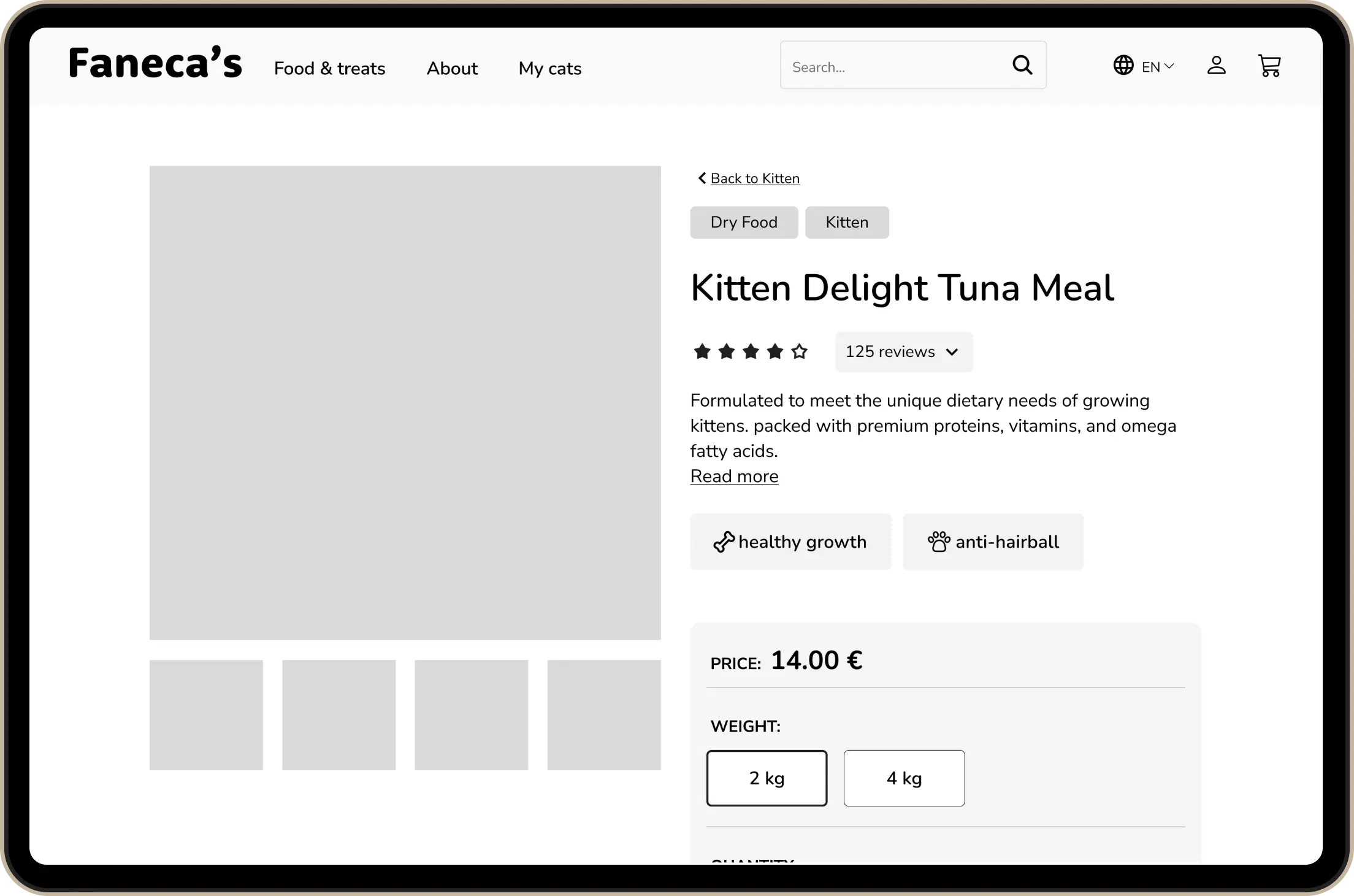
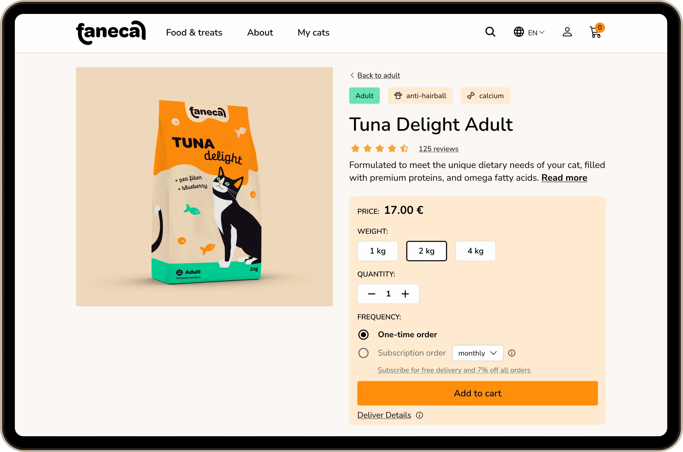
product page after
Better use of white space and tags changed, all main information is now displayed above fold.
It permits to reduce friction points on the product page leading to a smoother experience.
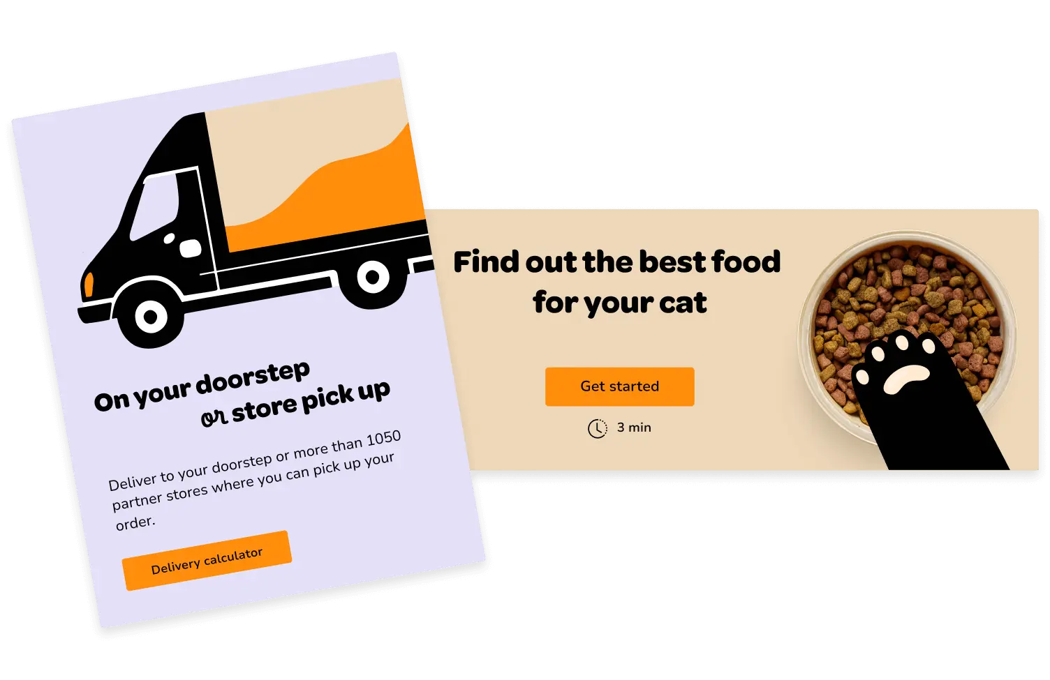
“If anything have a monthly / bimonthly buying option, for me as a cat owner I buy a big thing of dry food once every other month and I know others buy monthly.”
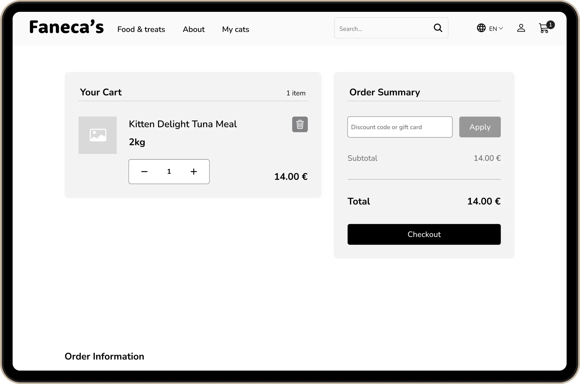
cart After
Though a few users were delighted with the subscription feature, others couldn’t find it at all.
Besides changes on the product page, frequency was added to cart page.
User can now alter the order easily and more transparently in cart.
Product vs about product, for a higher conversion
iterations & final content
Users reported frustration in finding the products on the homepage and confusion with writing.
In the final version, product sections appear upper on the page, and the informational content (about content) to familiarise the users with the product was enlarged and rearranged on the page.
Better understanding of expectations and empathising with the users meant a more engaging site and more time spent on each visit.

After
FiNAl
About product
Customer's needs and fears were addressed through content. Delivery can be calculated before checkout or any purchase. Information about subscriptions is clear and transparent. You can learn which food is better and more adapted to your cat.
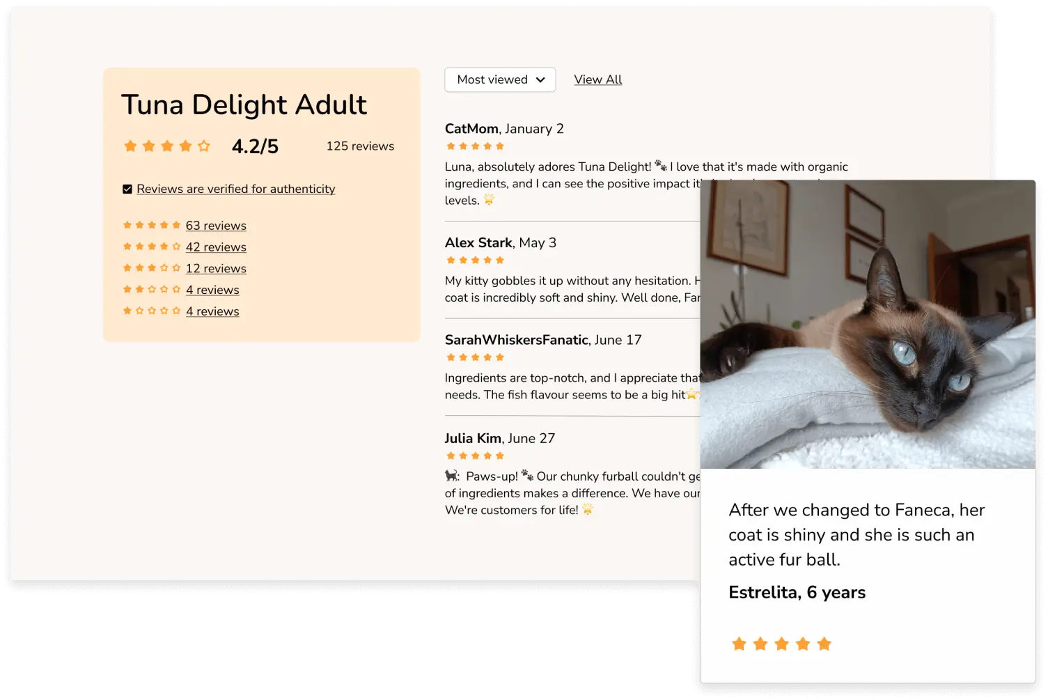
Reviews
Users effusively reacted to ratings and reviews. After iterations, a reviews section was added to the homepage for better reassurance and empathising with consumers.
Design & prototypes
END RESULTS

What our customers saying
reflection & SucCESS METRICS
In this case, the customers were the users testers and peers who reviewed the case. Instead of the average time spent on site, I could measure the time spent discovering the website on their own. And interpret their feedback to evaluate satisfaction and retention of users.
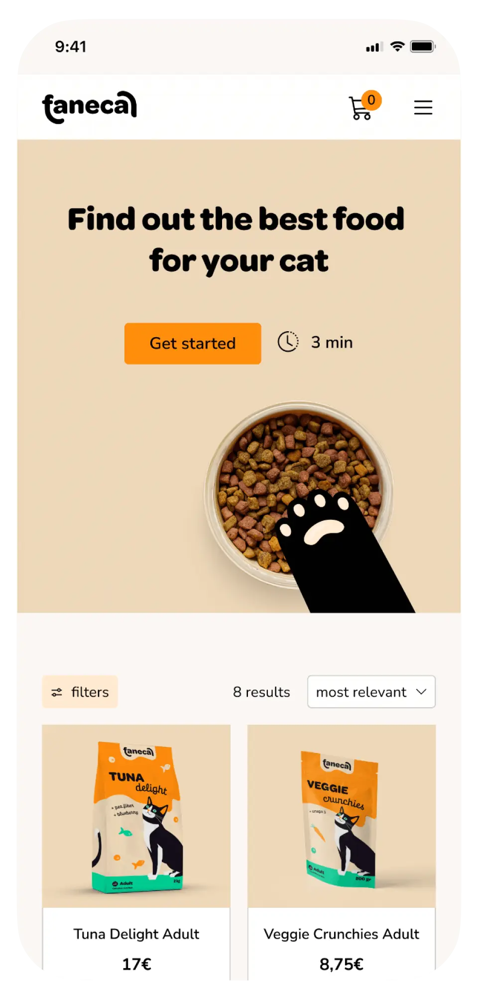
If I had more time, I would develop the mobile version and quiz page. According to users' voices, I would like to include a social side of the website, the user's page and the possibility to favourite items.
Product page
“I like the rating on the food options as well. Visually the page was not overwhelming or cluttered. Very straightforward, easy and informative.”
Steph
Subscriptions
“It makes me more inclined to consider signing up for a subscription because it honestly seems to be trying to provide me information and convenience without shoving it in my face.”
Melia
Purchase process
“Extremely easy, it's a very conventional process that you can see on majority of the websites I use daily, so I knew what to do.”
Ana