Accessible and scalable design system
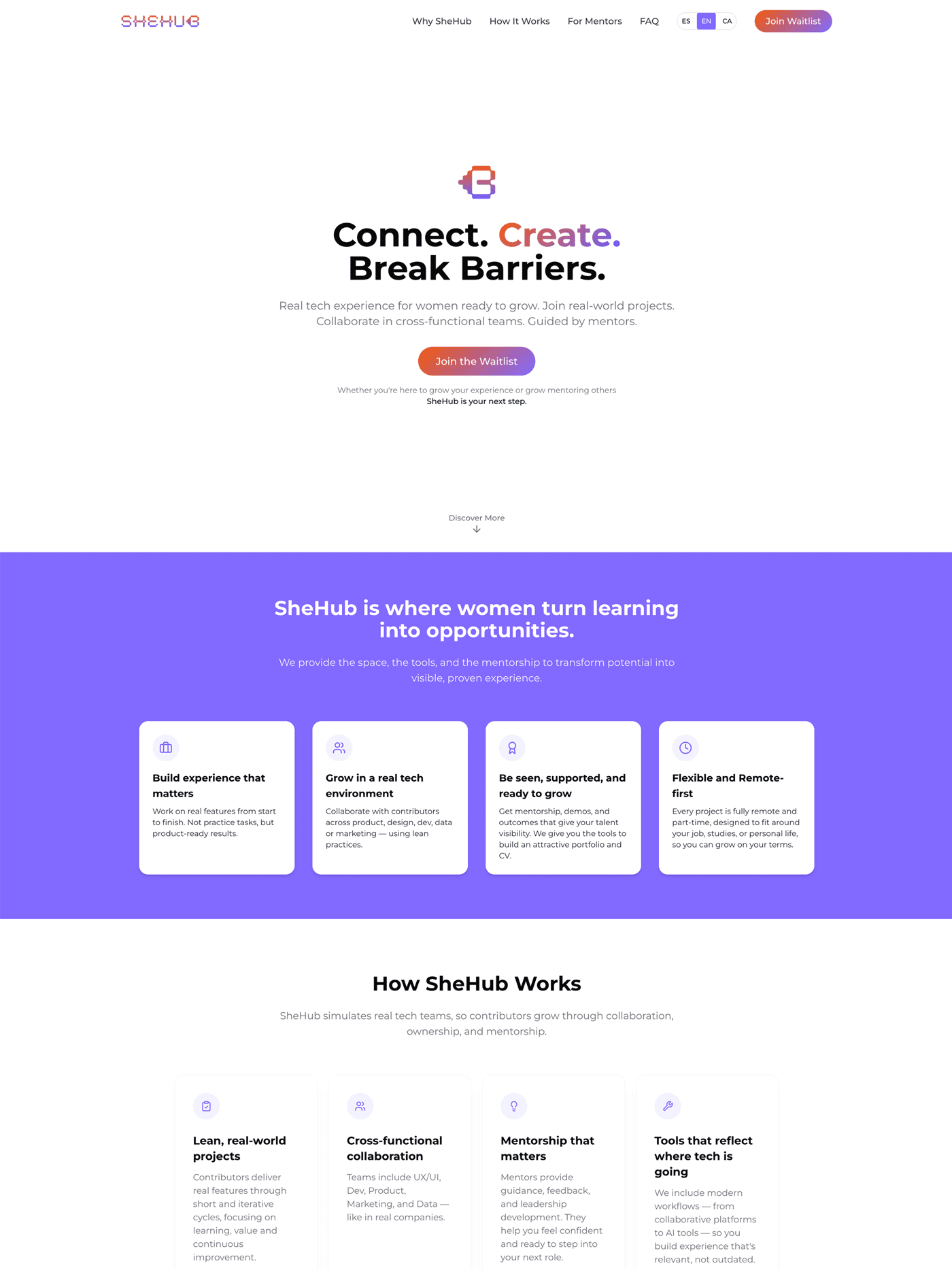
SheHub is a career growth platform for women, where bootcamp graduates can gain hands-on experience. SheHub wanted a more accessible and inclusive experience for mentors, collaborators and partners.
Athena was developed as a consistent and clear ground to support scalable and accessible design solutions for a trilingual visitor’s website.
View website demo
Date
2025
Client
SheHub
Team
UX leads: Solange Molina and Akanksha Passi
PM lead: Marta Latorre
Development lead: Jessica Arroyo
What I did
Design system and branding
My role
I worked on the discovery, ideation, definition, development and launch of the design system. And on the rebranding of SheHub’s identity.
The highlights:
- Establishment of a new colour system, colour semantics and colour tokens.
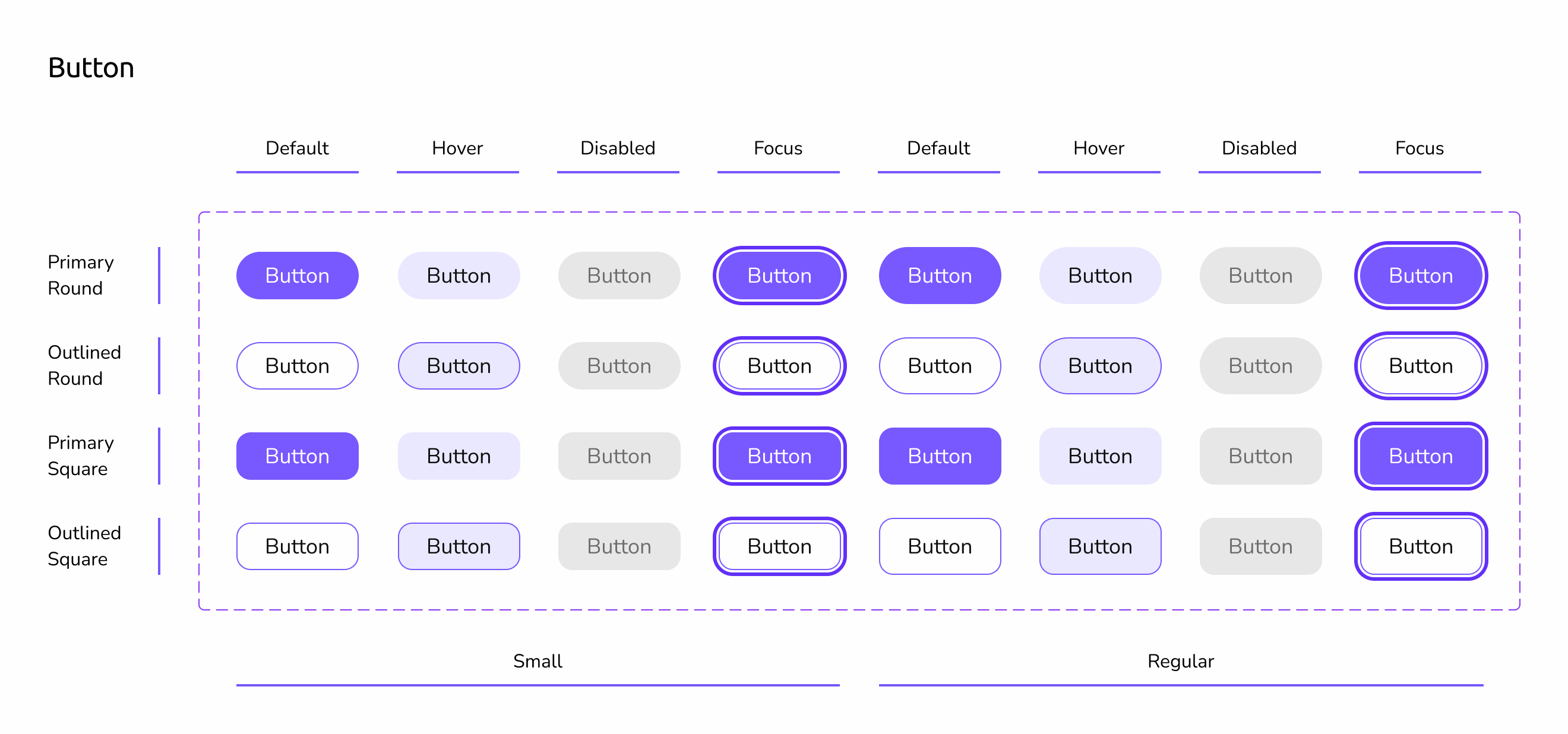
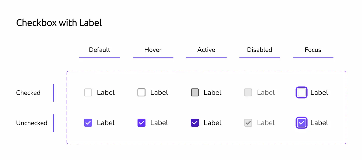
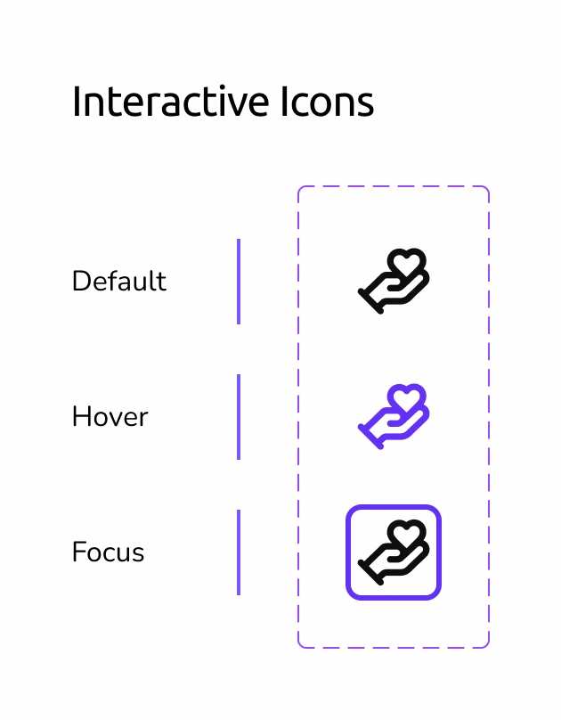
- Revision of consistency standards in UI in all components, as well as states in all interactive components, backed by research.


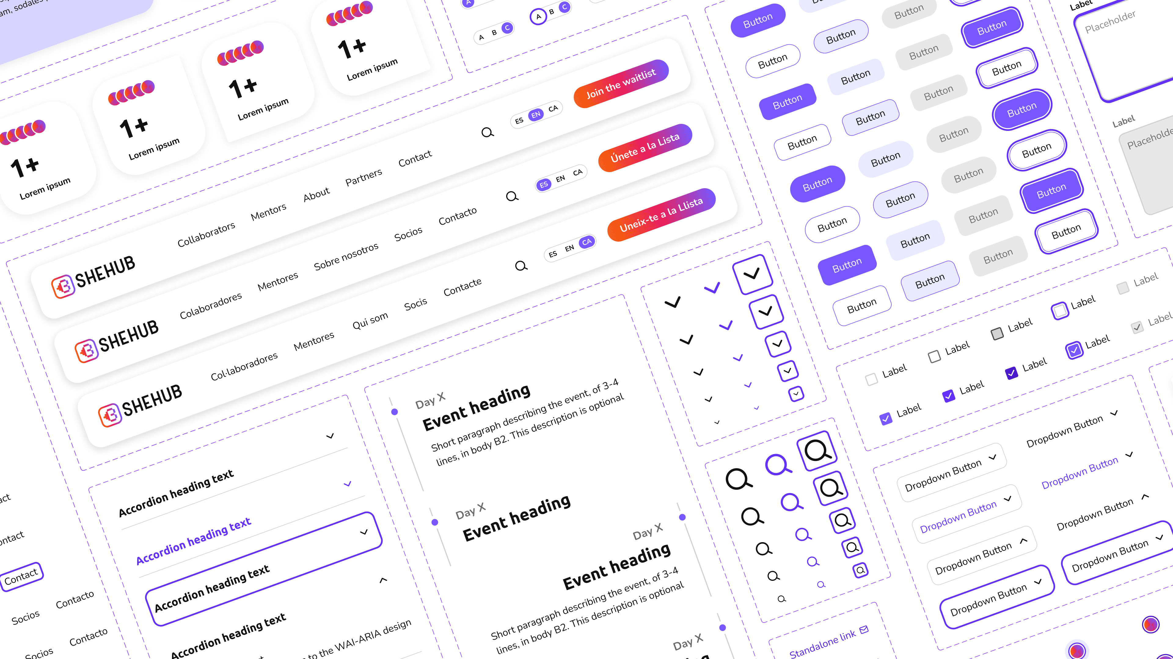
Foundations

Components

Guidelines

Documentation
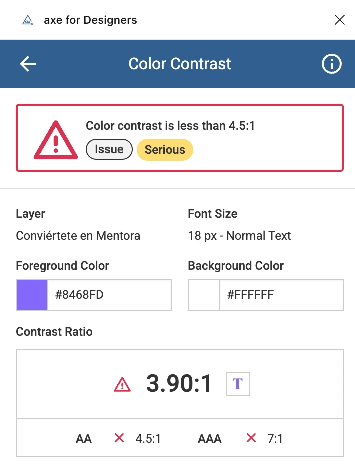
Not compliant
The process
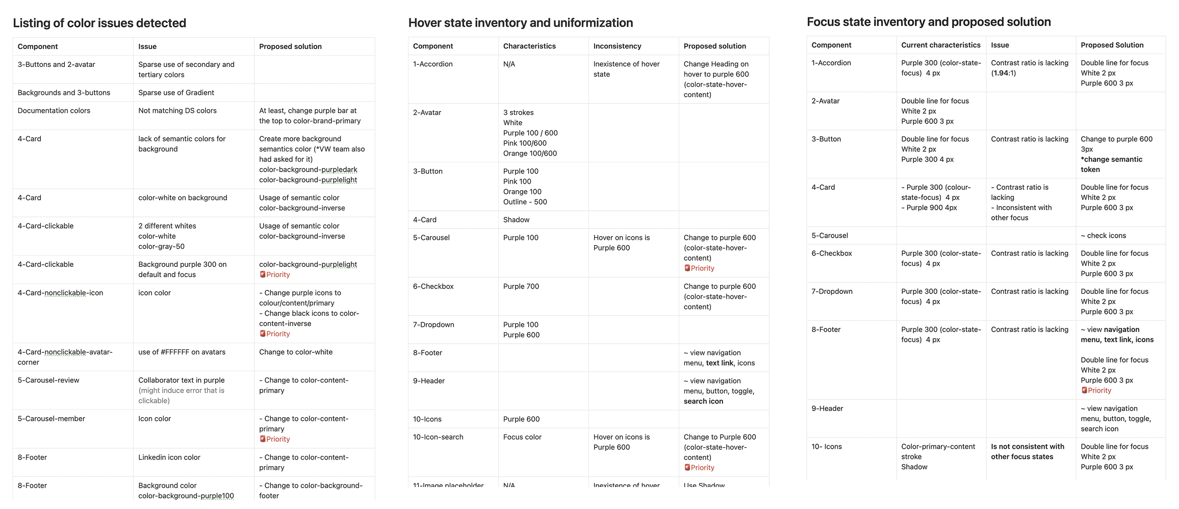
The system started by analysing the current design solution and testing its accessibility. Manual and automatic testing found numerous concerns, from colour contrast to HTML order.
Lack of contrast was seen throughout entire sections, buttons, CTA's, and large chunks of text.
Colour & tokens
foundations
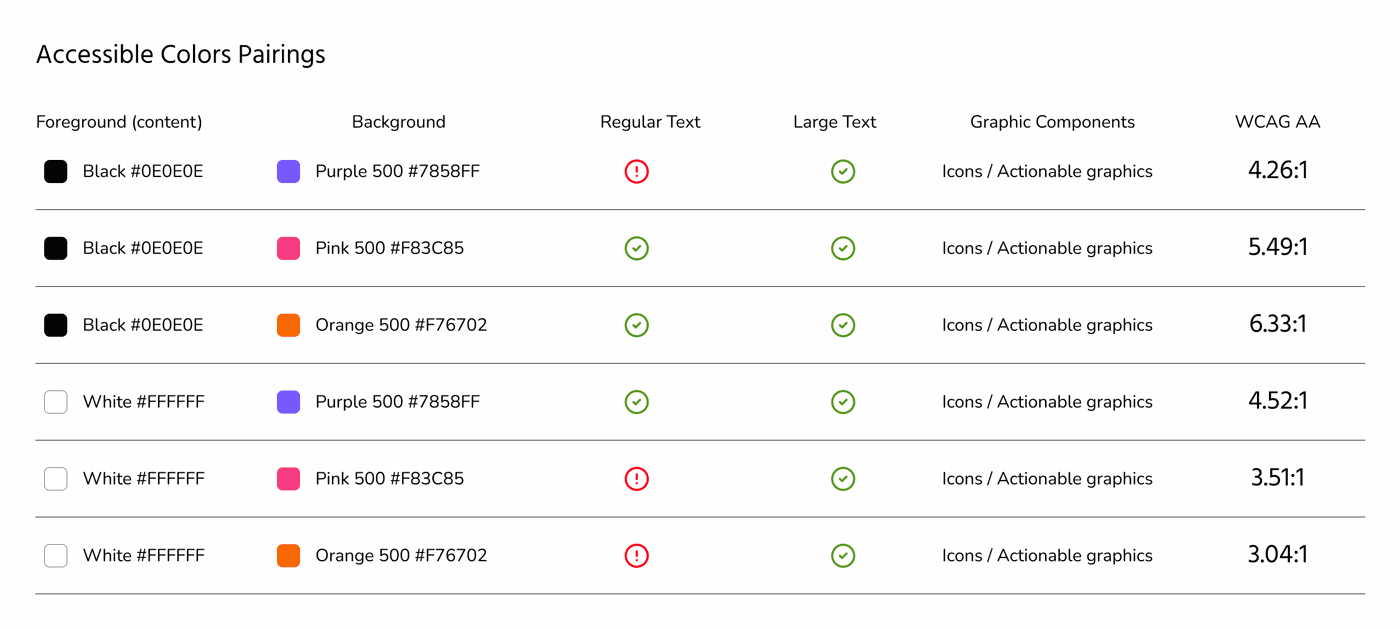
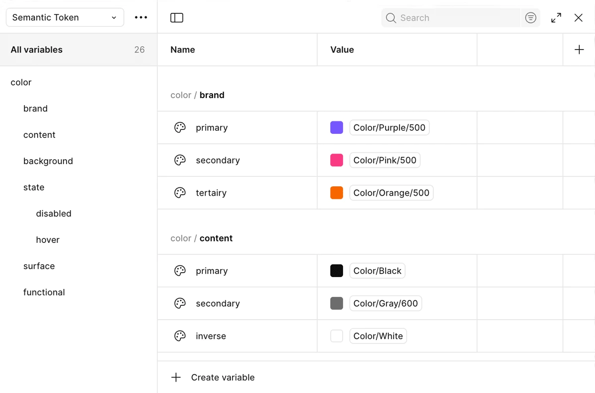
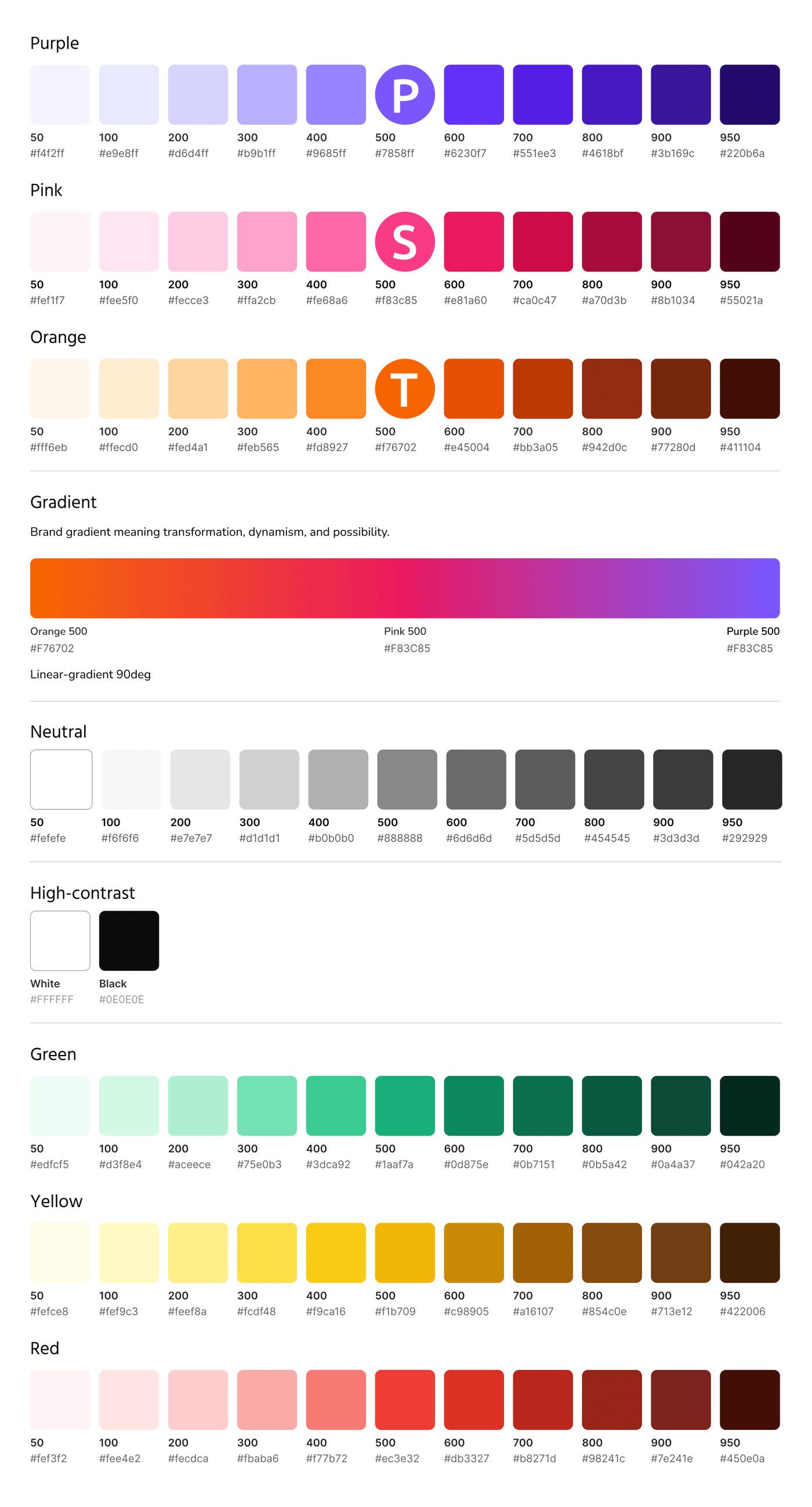
A new and scalable colour system was established based on the brand colours, with recognisable naming.
I've set primitive and semantic tokens. And documented colour semantic usage and accessibility guidelines to meet contrast requirements.
Clarity & accessibility
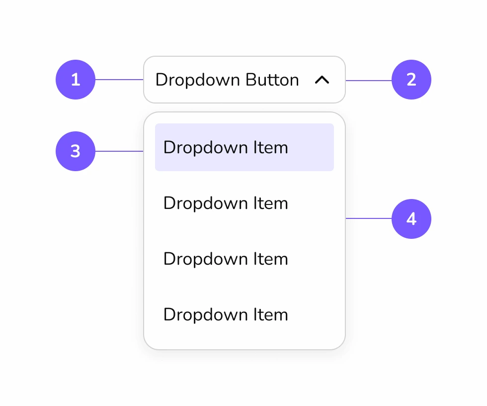
Components
Components were built with accessibility in mind, adhering to WCAG 2.1. AA criteria.
Comprehensive research on other systems was conducted. Adobe’s Spectrum and Tailwind were used as a base.
Each component and pattern was documented, including anatomy, usage guidelines and a WCAG checklist.

Refine and align
Documentation
I've conducted revisions in UI, unifying elements such as colour, spacing, naming and states in interactive components.
There was a continuous alignment with PM, UX lead and the visitor’s website team.
My work included meticulous documentation of iterations, clear to all non-design team members, and also to designers who would continue to grow the system.
Clarity, accessibility and efficiency
Impact & learnings
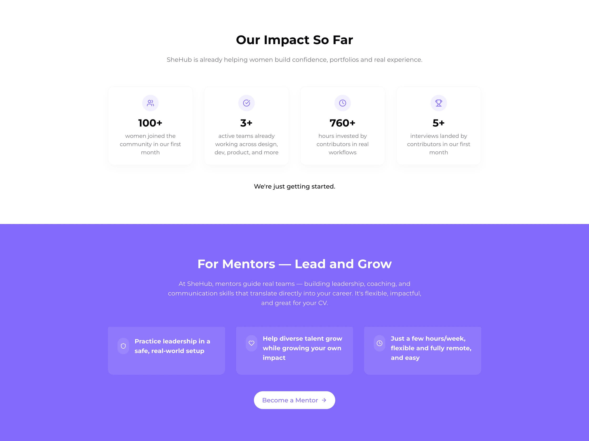
Athena is already a shipped product used by SheHub teams. It is contributing to speeding up page builds, improving cross-team efficiency and delivering an accessible and clear user experience.
A design system is a constant work in progress. It is a challenge to balance teams’ immediate needs while aiming for scalability and accessibility, clear communication channels and establishing priorities are key.
Before
After

What the team is saying
Reflections
Working on both Branding and Design Systems placed me in a unique position to better understand stakeholders and define, in a holistic and comprehensive view, a more accessible, inclusive, and digital-friendly image for SheHub across platforms.
"From the moment Filipa wanted to collaborate with SheHub, she not only brought that much-needed visual flair for detail, but also generosity and a great team spirit."
Solange Molina Urrutia
Co-Founder & director of User Experience
Co-Founder & director of User Experience
"Your work on the new color system and introducing semantic tokens helped lay the foundations for these big results. Your structured, precise approach have made a real difference 💜 Loved working with you!"
Monica Dinardo
UX/UI & visual designer
UX/UI & visual designer
"Filipa consistently brought clarity and structure to the work. Notably, she flagged several flaws in finished components, which sparked an audit and standardization across all design work."
Marta Latorre Pena
Product manager
Product manager